Adaptation to climate change
Cape York NRM is working on an exciting project that will boost the capacity of Cape York communities to plan for adaptation to climate change. Between now and June, we will work with up to five partner groups to scale down the science about climate change to understand the likely impacts in specific areas of country, and to work out what this will mean for the management of land and sea in those areas. Partner groups will work with the Cape York NRM team to identify the biggest issues or concerns for them, and the things that will help them to adapt to these changes, such as funding, research or monitoring. This information can be used by partner groups to inform Cape York NRM’s revision of their Regional Investment Strategy, to be conducted during 2017, as well as to develop funding applications, research partnerships, and on-ground management plans.
People living and working on country become familiar with the patterns of nature. These patterns - including owering and fruiting in plants, the ways animals behave at different times, where fires might burn and how high floods will rise - are related to the weather, in particular how hot or wet it has been (or will be). Many people on the Cape are talking about how longer-term weather patterns seem to be changing and how this is affecting these patterns. Some stories are documented in films on the Cape York NRM Atlas website http://climate.capeyorknrm.com.au/weather-stories/flms
People often say that temperatures are getting hotter. We have used long-term temperature data collected from weather stations across Cape York to plot how temperatures have been changing over time. The simple message: records show that it has been getting hotter across the Cape since the 1980s.
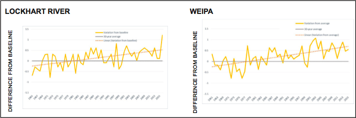
In the graphs, the yellow line shows how much the yearly average temperature is above or below average. We all know that some years are hotter and others cooler than ‘normal’ (that’s why the yellow line travels in a zig-zag pattern), but what the dashed red line shows is that, since the 1980s, temperatures have been above average much more often than they have been below. Even in years when temperatures were below average, they were not far below, compared with how far above average they were in other years.
The graphs above are for two locations – Lockhart River and Weipa – but data from Palmerville Station and Kowanyama showed similar patterns. The graphs use actual measurements of the maximum temperature recorded every day to calculate the average daily maximum for every month and for each year. To evaluate how and if temperature is changing over time, a 30-year reference period from the 1960s until 1990s is used; the average for this period is known as the ‘baseline average’. The average maximum daily temperature for each year was compared with the baseline average and if there is a positive difference between these numbers, the average daily temperature for the given year was higher than the baseline average, while a negative difference means that the average for that year was below the baseline.
Cape York NRM will work with partner groups using the most up-to-date science about increasing temperatures, evaporation, sea level rise, rainfall, cyclones and other climatic conditions to consider how management practices and planning can help natural systems and people adapt to climate change, and continue to live sustainably on the Cape.
For more information, contact Caleb Zaicz, Cape York NRM Engagement Officer czaicz@capeyorknrm.com.au 0447 030 077
-
< prev
-
next >